
Created on 99designs by Vista
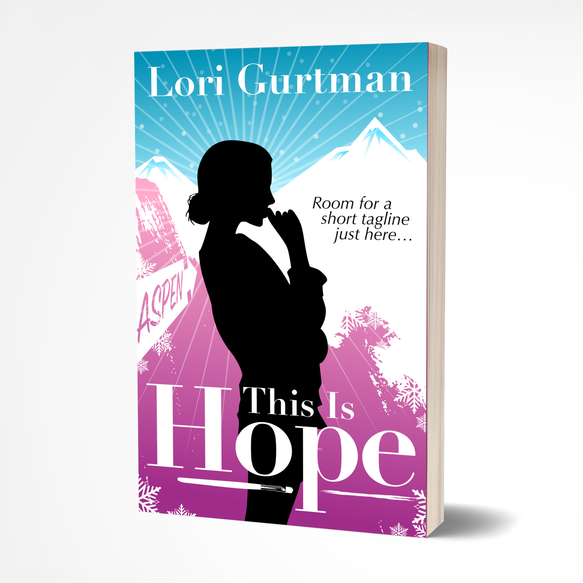
The brief asked for specific elements to be featured on a chick lit-style cover.
I opted for a commercial women's fiction look, simple illustration and silhouetted main character, with a feminine colour palette.
Everything was assembled in Inkscape. Silhouette, paintbrush and the splashes of paint were from stock images; mountain, sign and design elements drawn by me. Type chosen is typical for the genre.
Overall effect is a strong, commercial look that stands out on screen or bookshelf.