
Created on 99designs by Vista
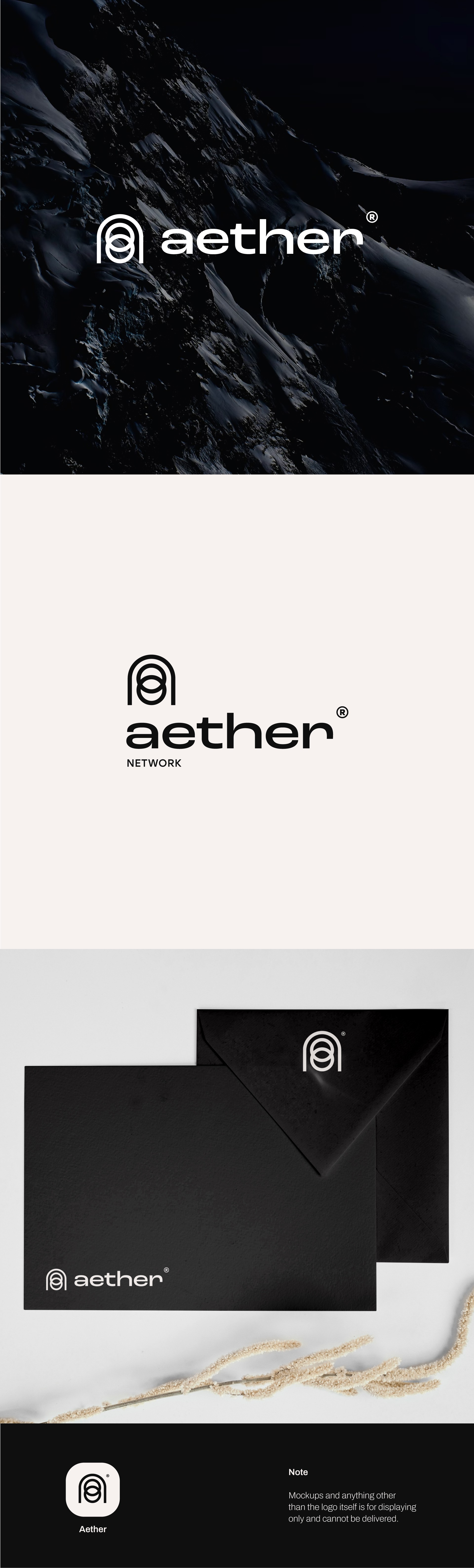
For this design, my intention was to create the icon using the A and also incorporate the “PORTAL” aspect into it. I’ve approached this mission by rounding the borders of the letter A, without the middle bar, and adding the rings inside.
The rings complement and make the icon unique, and it is intentionally put into the design to suggest the idea of “CONNECTION”.