(Entry) LOGO for: New Marketing Business located in small downtown location.

0
Created on 99designs by Vista
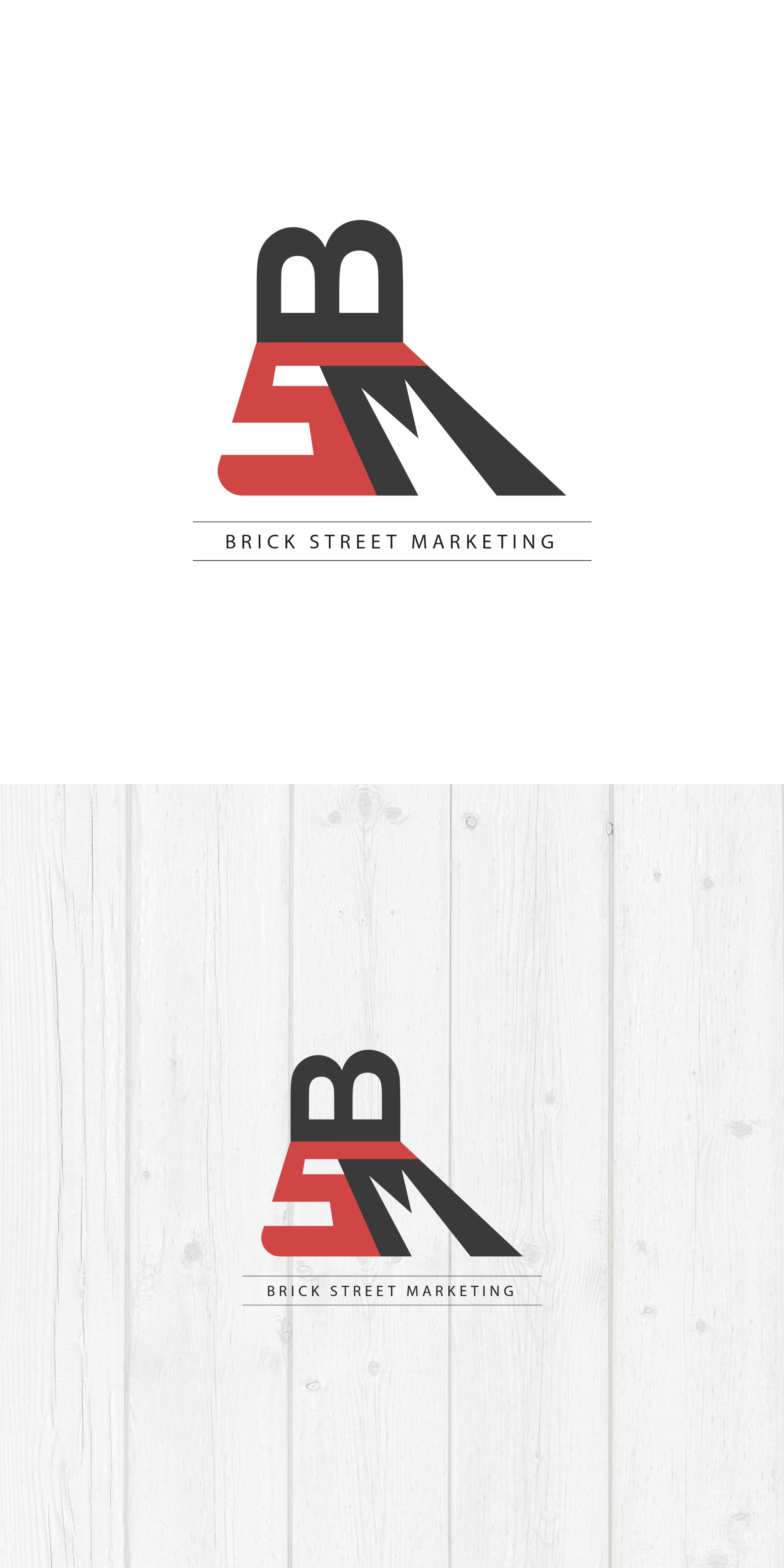
The lettermark is comprised out of 3 letters representing the initials of the company name, and this is what each of the represents:
1st Letter B
2nd Letter S
3rd Letter M
The red "brick" color represents the street, while the dark gray creates a firm touch that encloses the composition.
The type beneath the logo is divided by two lines to firmly put it in place and hold the weight of the composition above.