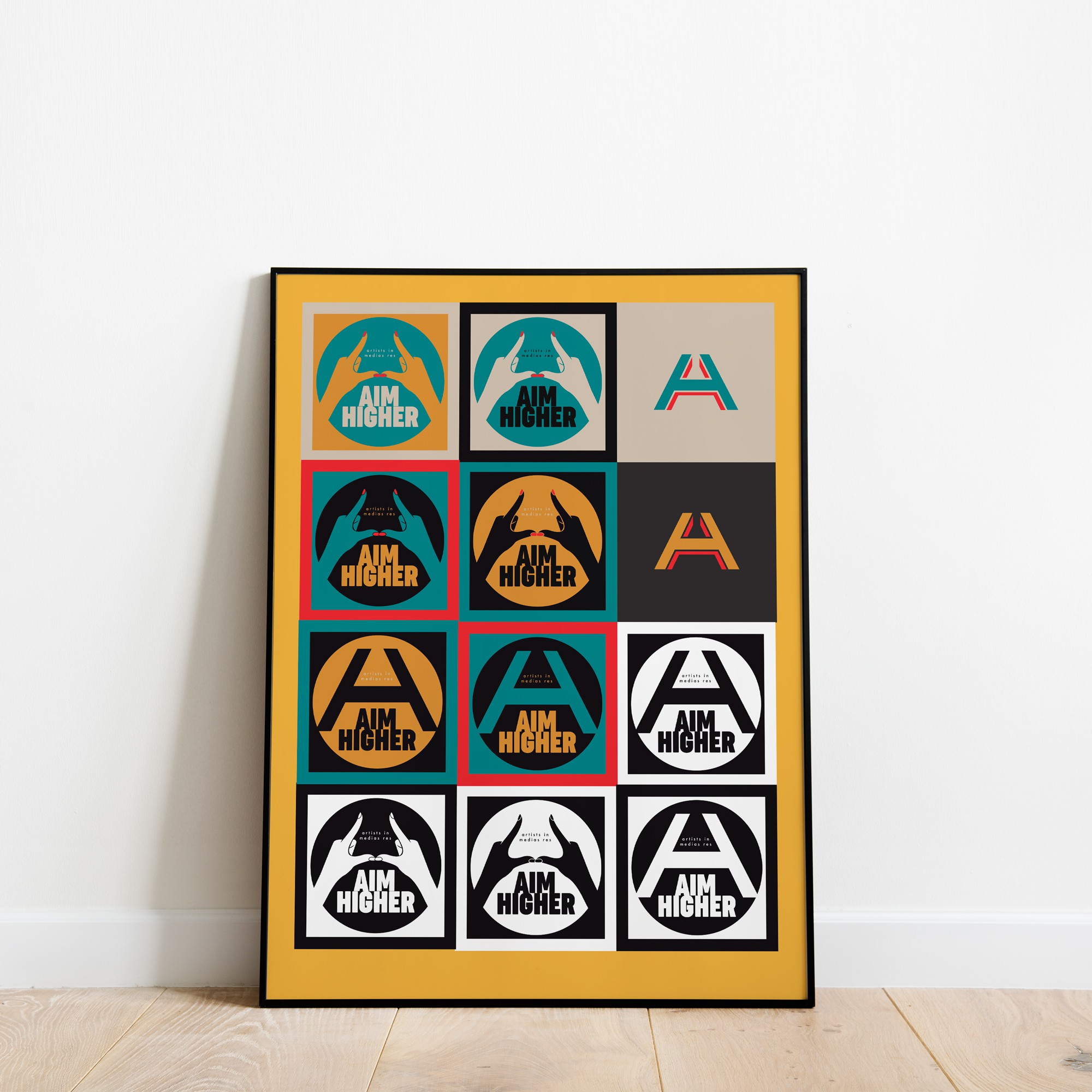
Logo and brand color concepts laid up on a poster design for Aim Higher
0
Created on 99designs by Vista
Wanted to show how a basic A and H (for Aim Higher) could be combined to form a strong mark. Also showed how that could be used in an organic way by incorporating human hands (for some of their alternative branding and campaigns). After all, the organization helps woman to "Aim Higher" and fights for their equality and growth in the professional word. A 5-color system was utilized to paint the picture for the brand.
