
Created on 99designs by Vista
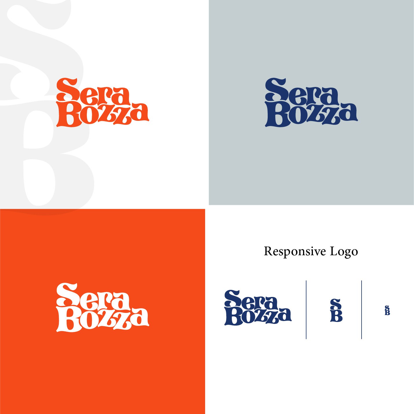
However, the S and B, (as my initials), must hold hierarchy over the other letters.
The consistent feedback I share is that I prefer the S & B to align, and perhaps the S & B can link.
I understand there is a balance issue because it is 4 letters, 5 letters,
But I am open to all combinations of the words sitting above each other, and alongside each other. The only request is that the S & B hold focus and attention.
I love 60's/ 70's inspired serif fonts, and a retro aesthetic. However I do not want a logo that will date too quickly. Therefore please draw inspiration from 60's / 70's but with a modern overlay.