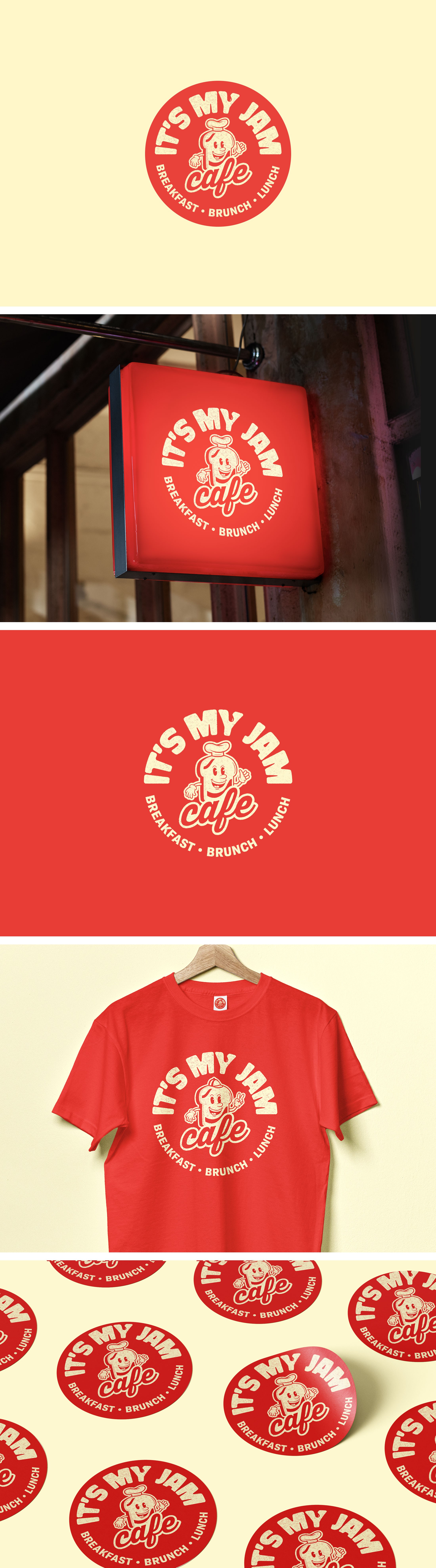

It’s My Jam Cafe, a family-run homestyle diner in Omaha, approached me to refine their existing logo. While they were generally happy with the original design, they felt it lacked a touch of professionalism. After evaluating the logo, I envisioned a retro, vintage-inspired update that would enhance its charm and give it a timeless feel. Using a simple, bold two-color palette, the redesign captures the café’s warm, inviting atmosphere while staying true to its classic diner roots. The result is a logo that feels both nostalgic and fresh, perfectly aligning with the café’s friendly, down-to-earth vibe.