
Created on 99designs by Vista
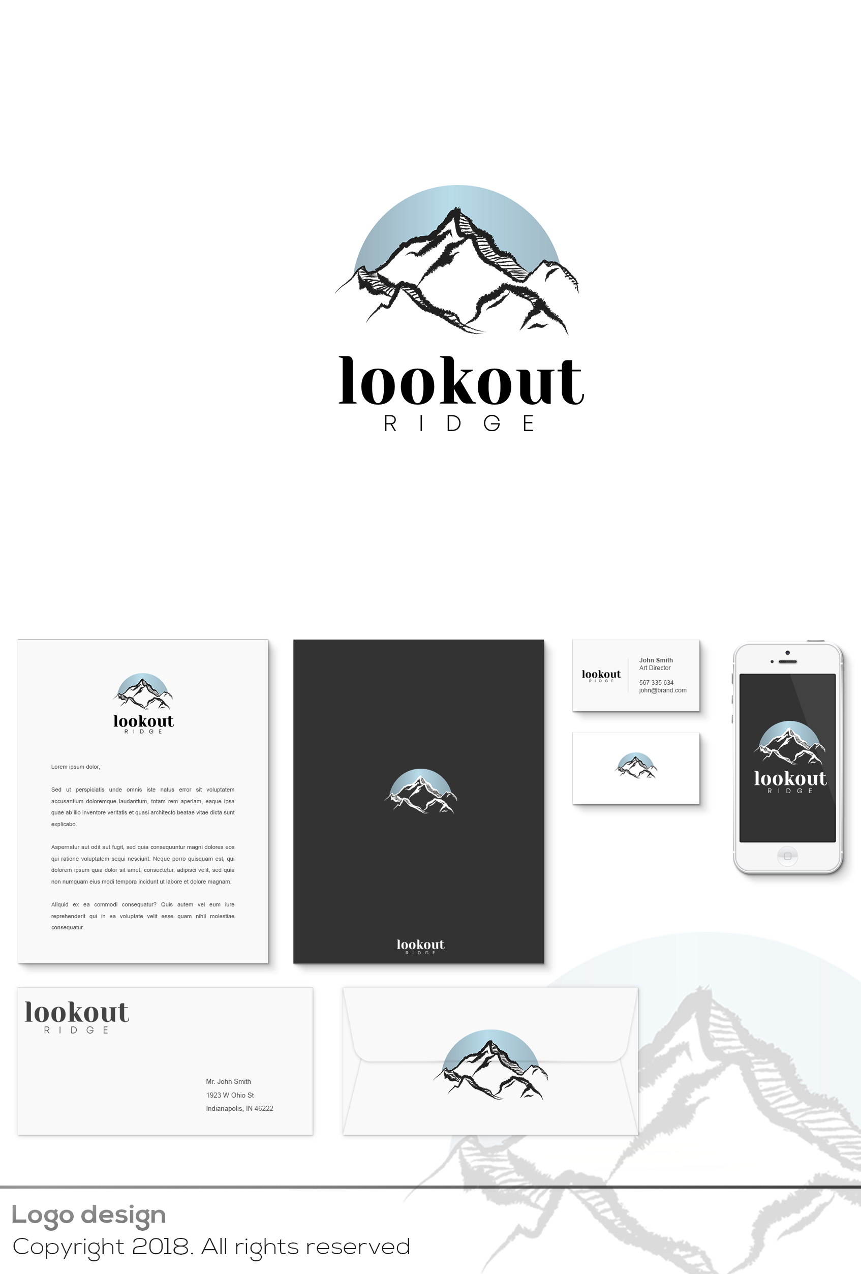
I have enlarged the lower part of the typography, I have also increased the space between letters to create a movement effect.
I wanted the typography to be more elegant since it inspires more security and firmness.
As for the isotype, I have redistributed the blue gradient.
Before, the gradient was dark blue grayish on the bottom and on the upper one a light blue gray, in the current logotype I changed the orientation so that it is horizontal and creates a matt effect, playing with the same movement as typography.
As you can see the white version on black and darks backgrounds, it is very pretty and fits perfectly.