A logotype, also known as a wordmark, is a text-only graphic created to uniquely brand a company’s name. Logotypes come in thousands of variations, shapes, sizes, and styles, all with a common goal to quickly communicate a company’s message, and grab the attention of its desired audience. This is why the logotypes you design MUST be simple, original and stand out on their own.
You don’t need to be a typographer to create a unique logotype, however. Instead, you can start with the framework of an existing font and customize it to be uniquely yours! Open your Adobe Illustrators and let’s get to customizing.
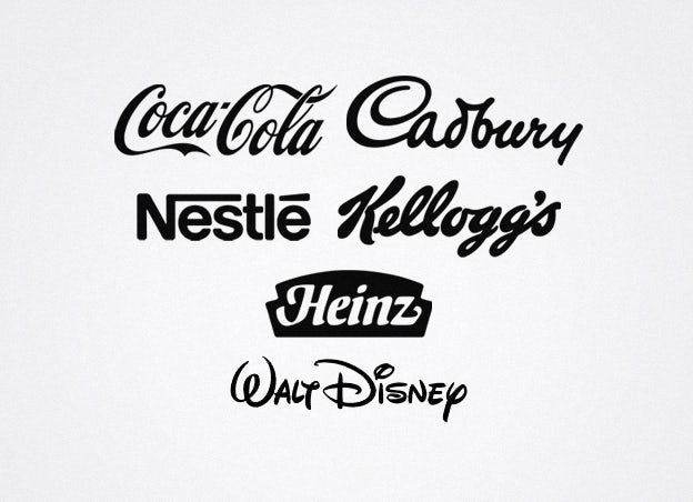
Here’s inspiration from generations past — the likes of Coca-Cola, Kellogg’s, Cadbury, Disney, Nestle, Heinz, etc. These brands became household names, trusted for their quality and price, and their logotypes are still recognized by all.
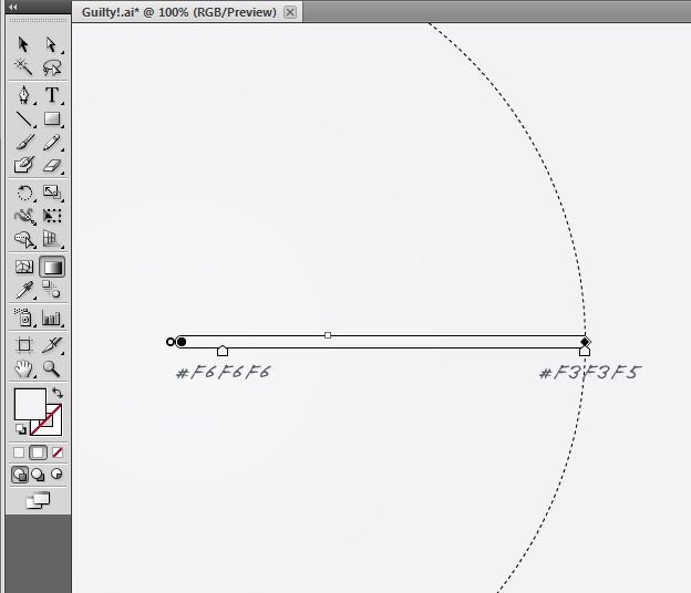
First, let’s give the font a nice background — create a subtle gradient from #F6F6F6 to #F3F3F5.
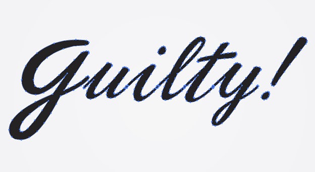
I’ve browsed over my font collection, compared different styles, and decided to use the Phoenix Script font.

Now, we want to manipuate the text, so we need to convert the font to outlines. You can either Expand the text (Object > Expand), or Outline it (Right-click > Create Outlines).
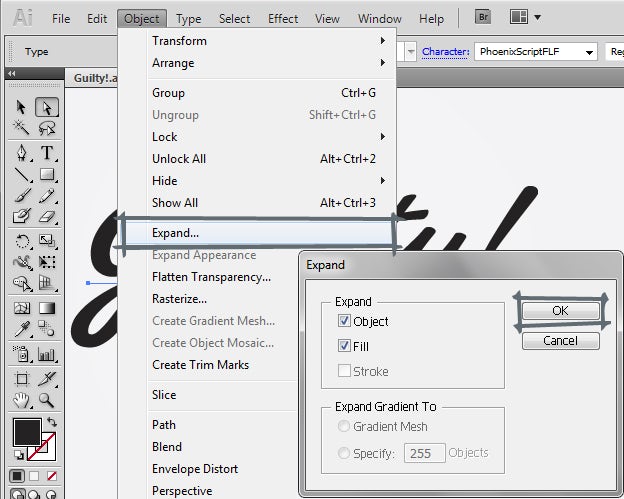
The text has become a shape that is editable.
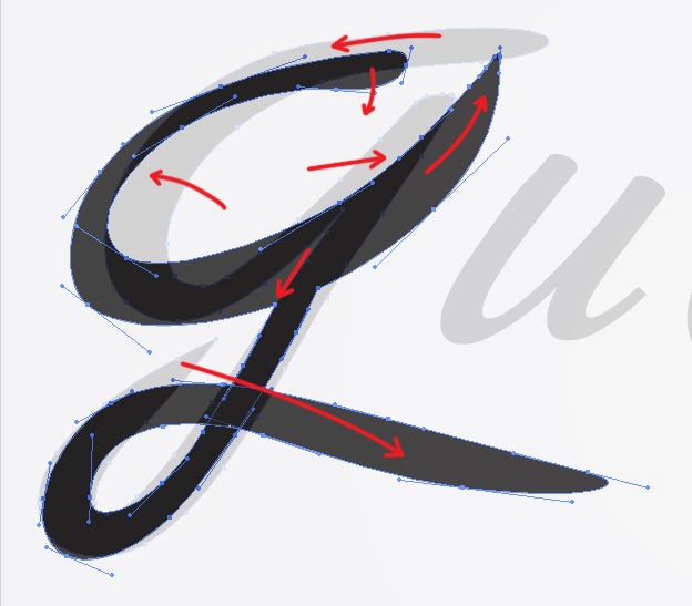
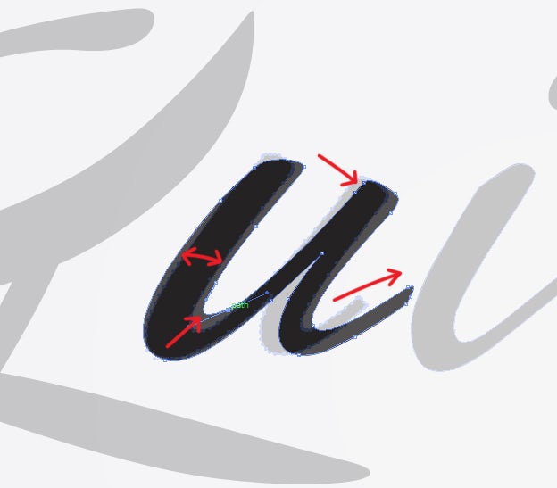
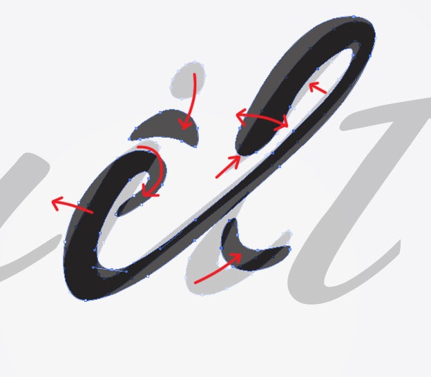
Continue by deleting unnecessary parts using the Eraser tool ( Shift+E ).
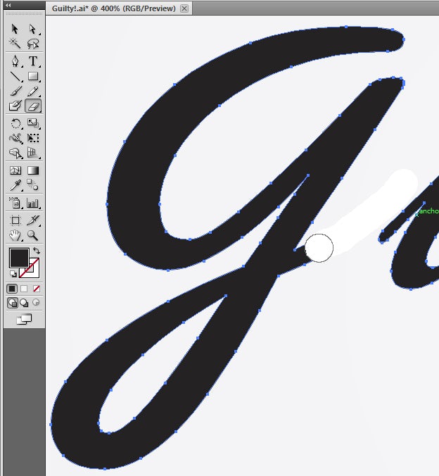
Smooth out your eraser marks by deleting a few anchor points with the Delete Anchor Pen tool (P).
Next, we want to reshape and edit specific paths by selecting that path’s anchor points using the Direct Selection tool (A). If you’d like to select multiple points, then press Shift while you click.
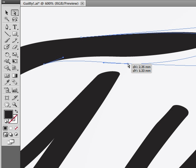
Now, we are going to reshape each letter.
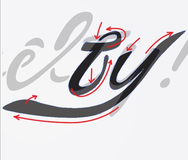
Let’s bring everything together. Use the Direct Selection tool (A) to delete the tail from the letter G. Then, use the Pen tool (P) to create a new shape that starts from the open points of the G, and underlines all the letters. Where you place the specific anchors to make the shape is all about instinct, and what looks good to you. You can use the Direct Selection tool to smooth it out and make it solid.
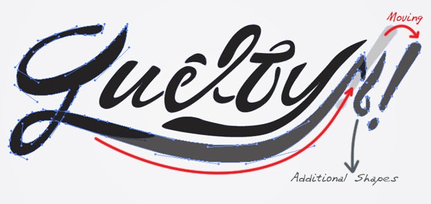
Next, I’ve added an additional shape to the wordmark, to make it more of my own.
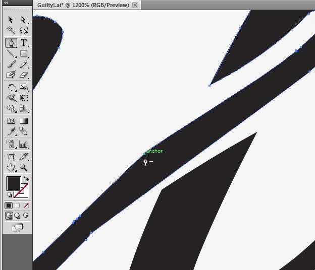
Continue to experiment with (and clean up) the paths and anchor points.
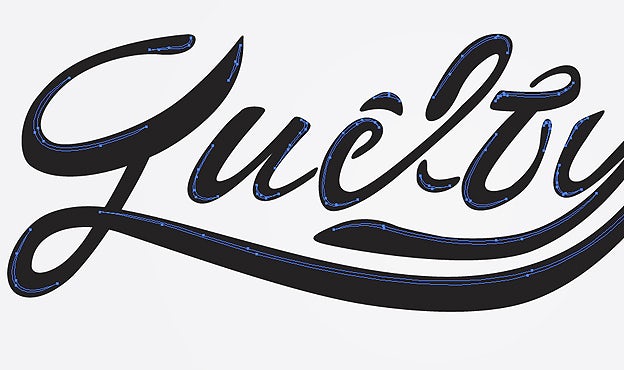
Let’s add highlights to the text by creating smaller shapes on each letter.
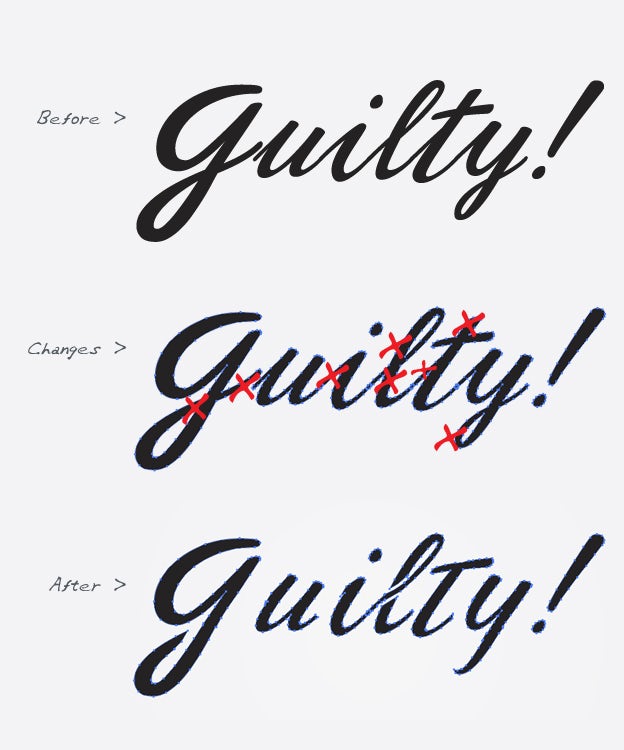
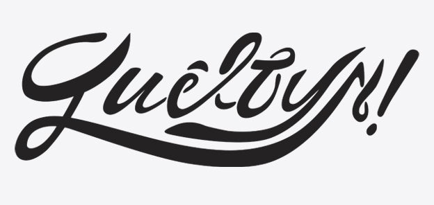
Here’s the result:
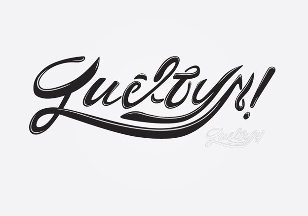
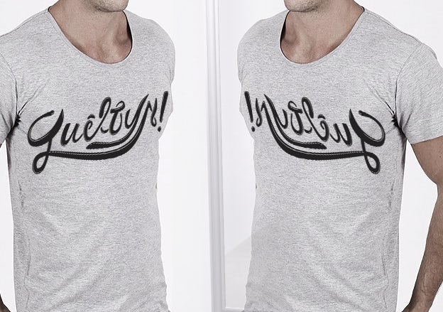
And finally, I’ve flipped the wordmark “Guilty” horizontally, in hopes that it would read “Innocent”. Do you see it?
That’s it — have fun creating your own logotype!