A picture may be worth 1,000 words, but how do you take the 100,000 or so of them in a book and consolidate them into a single image? Book covers help readers instantly decide if a a book is meant for them. After all, a single image is a lot quicker to digest than 150+ pages of text.
So how do you make sure that a cover captures the soul of a book and intrigues the right reader to pick it off the shelf (whether physical or digital)? Start with genre. This article explores how to design book covers for different genres of literature, so when your book is judged by its cover, it’ll come up a winner.
Fantasy & sci fi covers
—
Sci fi and fantasy books are all about imagining scenarios and worlds that are impossible or improbable in our current state of technology, society or environment. Think long distance space travel, dragon-regulation politics, or even man-made atmospheres. There are several cover techniques to use in order to make these worlds seem more real:
Merge the real with the unreal
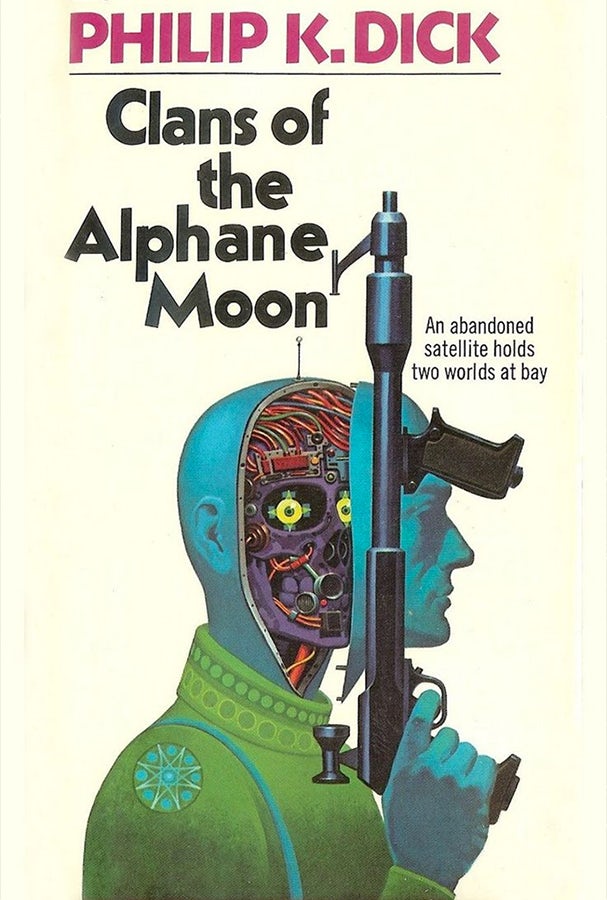
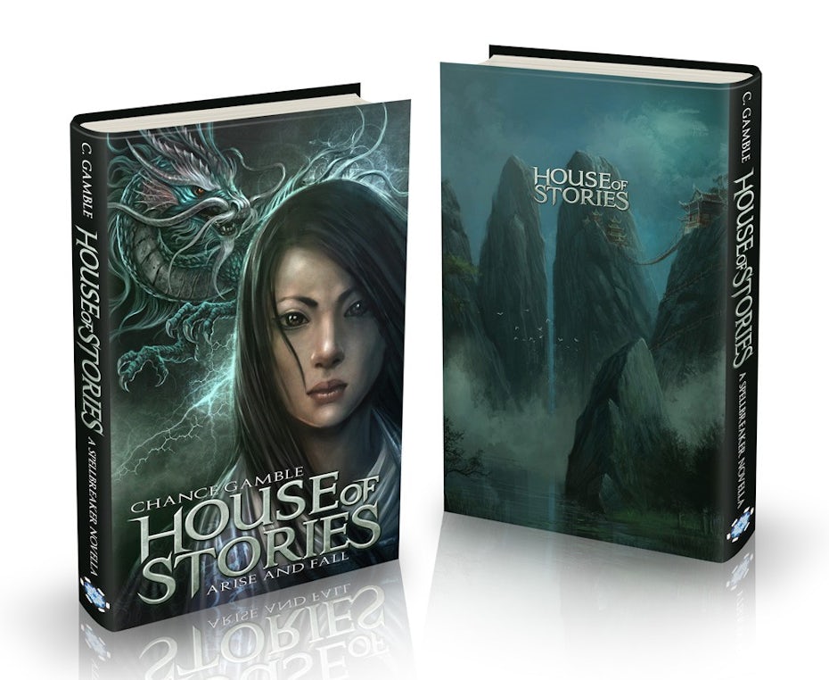
Sci fi and fantasy novels explore real world, human themes in far-fetched worlds. It should come as no surprise, therefore, that many of their book covers visually mimic this binary theme. To do this, they combine a representational style of illustration—grounding the design—and pair it with surprising or unusual elements, be in monsters or technology.
Show the drama
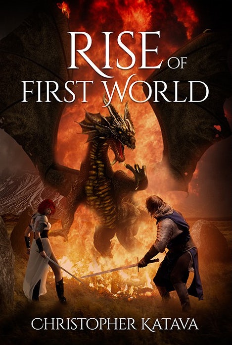
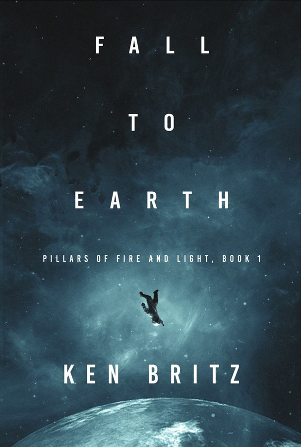
Another well-used technique in sci fi and fantasy book cover design is the depiction of dramatic actions, expressions and imagery. This should come as no surprise. Sci fi and fantasy books are often dramatic and action packed! Notice how Fall to Earth features a man abandoned, falling through space, or Rise of the First World shows the heroes in the middle of a battle. Very dramatic!
Create a mood
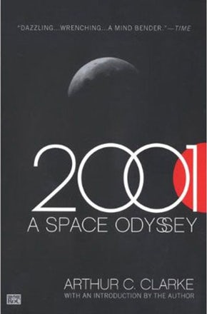
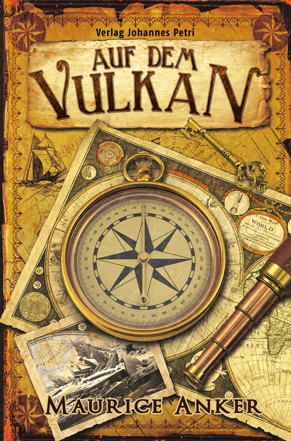
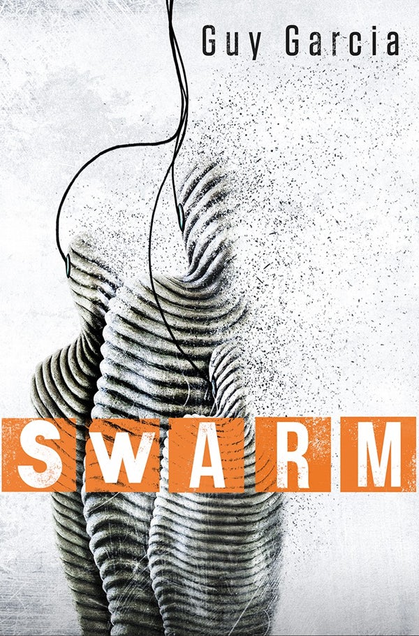
Lastly, we mustn’t forget the way in which sci fi and fantasy book covers attempt to create a world with looming tension. There is sometimes a sense of serenity, as if to depict the calm before the storm. A perfect example of this is 2001 A Space Odyssey which feels quiet and calm in it’s expansive use of negative space, yet somehow dark and frightening in it’s flat grey and bright red color palette. Alternatively, science fiction and fantasy book covers can create a sense of unease with surreal imagery—like cover for Swarm—or adventure—like Auf Dem Vulkan.

What to keep in mind
The subject matter and tone of your book are the most important things to keep in mind when designing a cover for sci fi or fantasy, but there are a couple of other design trends that help readers know the genre:
- A large number of modern sci fi and fantasy novels use all caps titles. More classic, old-world looking serif fonts are in fantasy and modern, clean sans serif fonts in science fiction.
- Blue and amber are the two most used colors. Blue creates the feeling of the calm before the storm, and amber lighting connotes something other worldly.
- Smoke, clouds and fire are popular mood-setting textures.
Romance covers
—
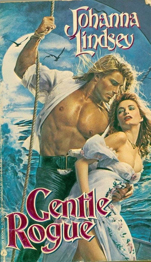
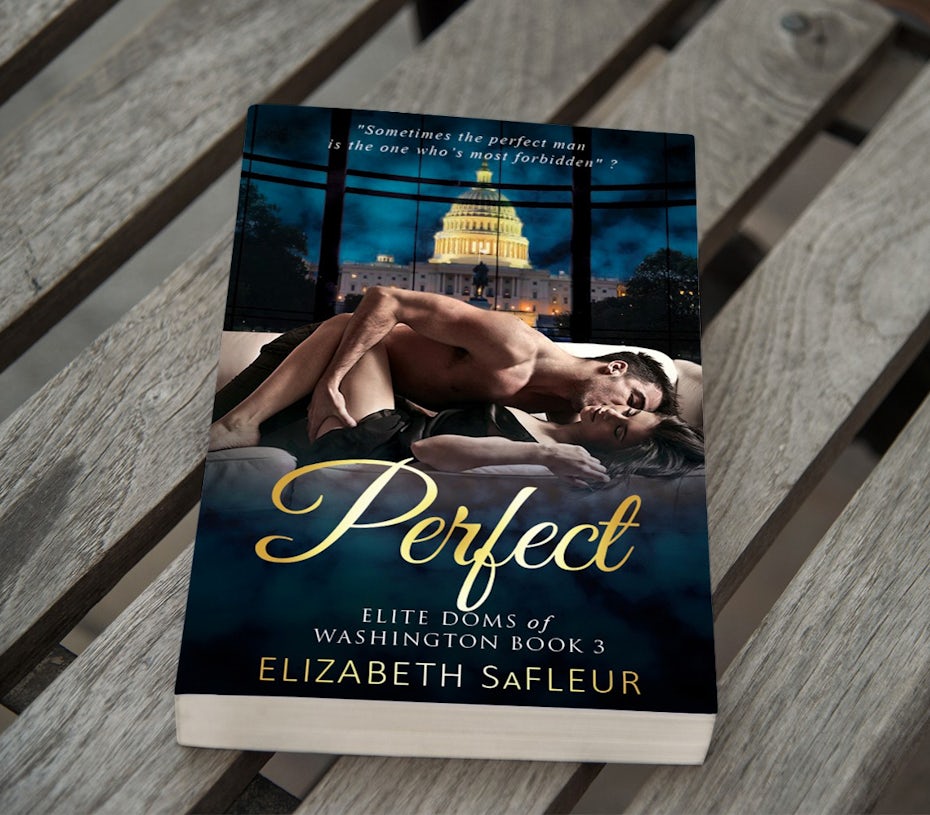
The huge stereotype in romance cover design is two half-naked figures passionately staring at each other. Love it or hate it, this style of book design is vastly popular. It lets the reader know that these books offer something that’s hard to find in this world: love and passion. But this isn’t the only way to do a cover for a romance novel. The key to a good romance novel cover is to show that the book is, well, romantic, and to hint at what makes your book unique. Here are a few ideas:
Go traditional, with details.
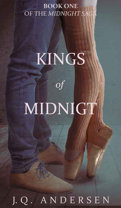
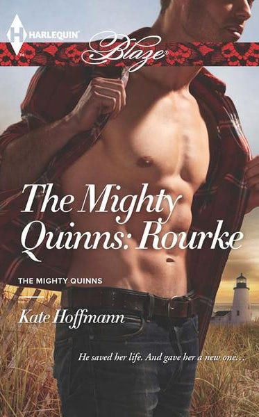
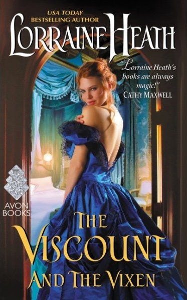
Romance is about the connection between two people, so a great way to get that concept across is to show two people connecting. You can do this with the classic, irresistible hot-and-sweaty design style of showing bodies intertwined, or you can be more subtle about it. Many romance novels don’t show the faces in their cover image, because it allows readers to more easily get lost in the story, perhaps imagining themselves as the hero or heroine. A romance novel can be particularly evocative when you only show parts of a body, be it lips or feet. It focuses on sensual body parts makes the reader wonder what is happening that isn’t pictured. They key to making these covers unique? Bring in details that hint at characters, like on the Kings of Midnight cover, where the feet clearly belong to two very different types of people.

Have some solo fun
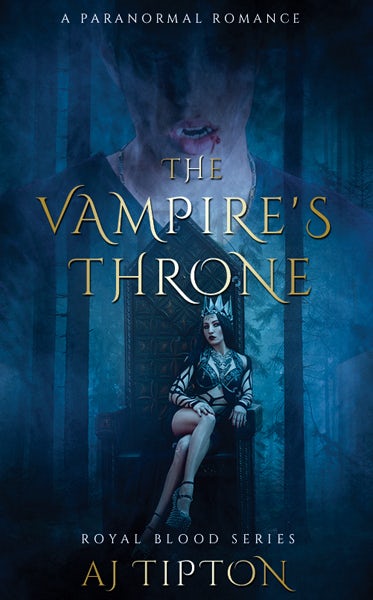
Some romance novels are more about one individual’s journey—whether it’s erotic or romantic. Often times these books picture the protagonist on the cover, with subtle cues that tell us what the book is about. The Vampire’s Throne, for example, puts the scantly clad heroine in a provocative stance, showing off a lot of leg. In the background, a man’s mouth hangs open with a drip of blood. It’s not an actual picture of sex, but damn if it doesn’t tell you that that’s what the book is about (at least in part).
Use objects as foreplay
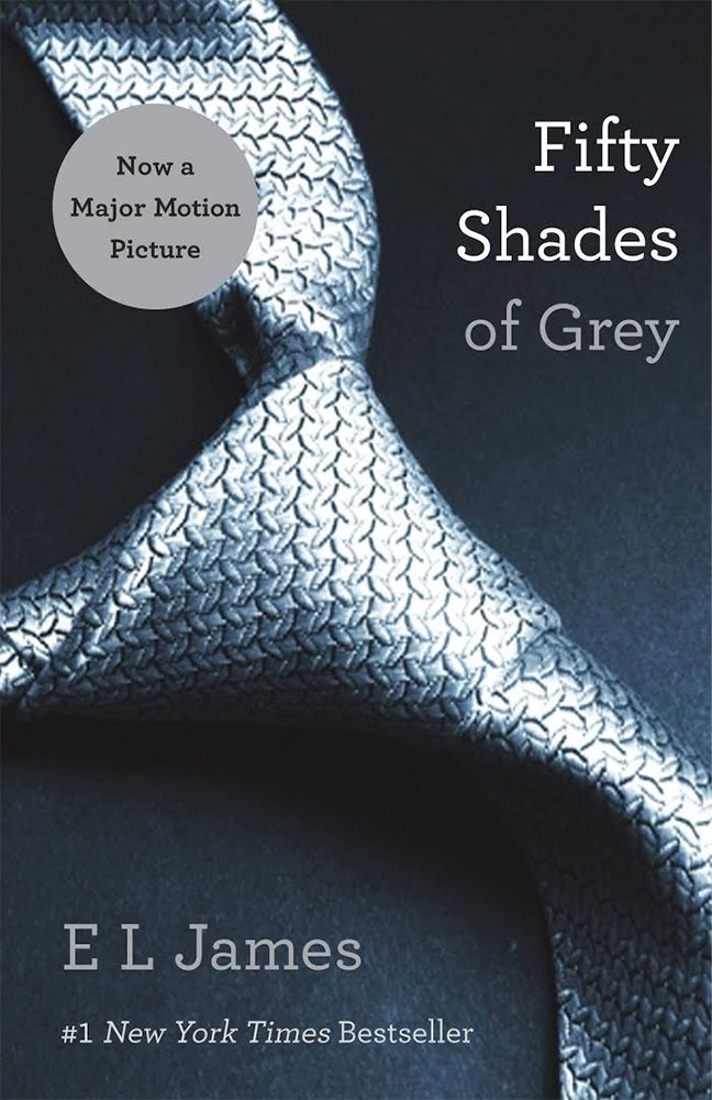
In recent years, romance novels have taken to building the tension and appeal by using provocative objects as surrogates for bodies. Take for example Fifty Shades of Grey, which depicts a necktie. The choice of image clues the reader to the sexual practices of the main characters. It’s a great example of how to be provocative without showing any skin!

What to keep in mind
Romance novels are about the connection between two people. There are multiple ways of showing this. You should use what’s best for your individual book. A few things to think about:
- More traditional romantic romance novels tend to prefer soft colors: lilacs, pinks and golds. More erotic romance novels go bold with deep, bright colors, often paired with dark images.
- There is a lot of freedom to play with font: use it as a device to tell us what kind of romance novel you’re writing. If it’s classic or historical, perhaps choose a script-based font. Modern and edgy? Choose an equally modern and edgy font.
Font choice further reels the reader into the serious world of romance.
Thriller & mystery covers
—
Thrillers and mysteries get our hearts pumping and our brains working as we try to figure out whodunnit. A good book cover in these genres will do the same. Readers want to know just enough to draw them into the story, but don’t want the spoilers revealed (bonus points if you can hint at them so when the reader finishes the book they have an “oh yeah!” moment about your cover). Here are a couple of our favorite techniques:
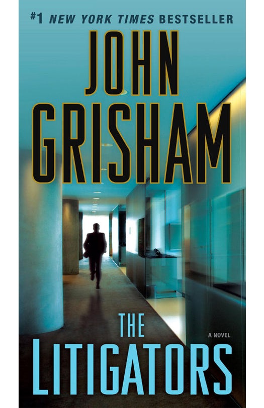
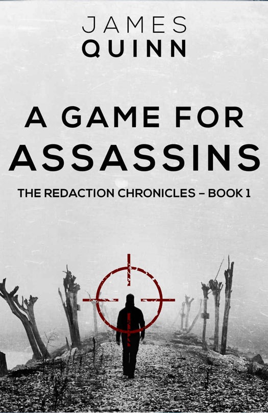
Use perspective
Thrillers and mysteries have layers, and with each chapter you get deeper and deeper into it. Many thriller and mystery covers use images with deep perspective, leading the character (and the reader) down that path into the unknown. This technique is a favorite of renowned thriller author, John Grisham, and is used on many of his covers.
Make your title the focus
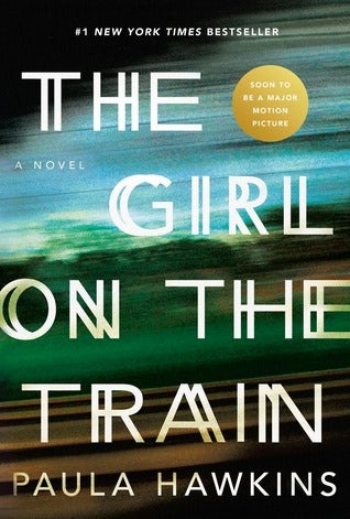
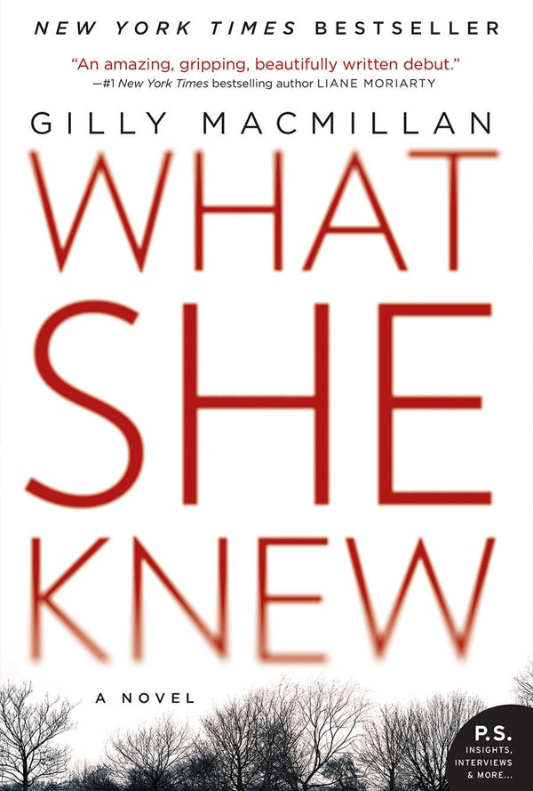
Mystery and thriller covers are unique in that a large percentage of them make the title the graphical focus. This is because the titles are often so good at setting the moods and building the tension—any visual image could spoil a twist. When the title is the focus, the text generally has some interesting graphical element to tie it to the surroundings or themes of the book. For example, The Girl on the Train cover shows a blurred background and some of the letters are offset, creating a discombobulating feeling, which could be caused by the movement of the aforementioned train, or something else…

Make it unclear what we’re looking at
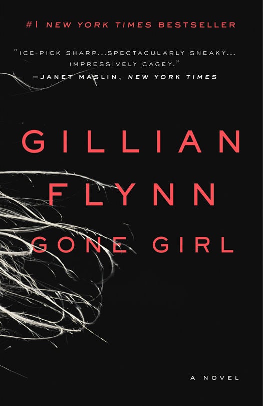
When something is a mystery it’s unclear. That’s pretty much the definition. To bring this theme into your book cover, you can show us objects or use images that are an obscured or placed out of context, leaving the reader to wonder what they are and why they’re there. Take the Gone Girl cover: what are those white lines? Are they hairs of a girl fleeing? Hairs left at a crime scene? Or something else? Alternatively, you can use a silhouetted, blurred or partial view of a character. This design trick leaves us wondering if this is the good guy or the bad guy, and what exactly they’re up to.
What to keep in mind
The main goal of a thriller or mystery book cover is to build up the tension. You can do that in a number of ways. A few parting thoughts:
- A large number of mystery and thrillers use red as an accent color, probably because of its association with blood and heightened emotions. Red screams danger!
- Many mystery and thriller covers are high-contrast, meaning they use deep blacks and white whites (or bright colors) to heighten the tension.
- Font choices are predominantly angular sans serif fonts. The harsh edges of this type of typography again helps create a stark, edgy feeling in the design. When serifs or softer fonts are used, it’s usually done so for a particular purpose.
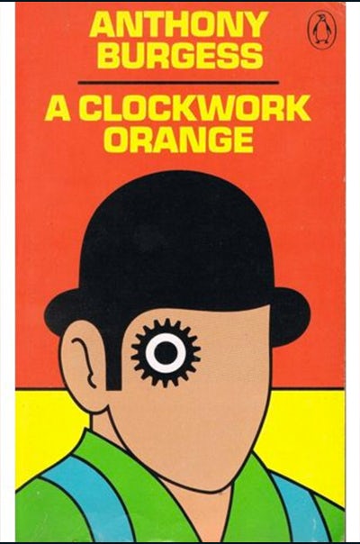
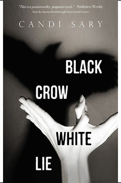
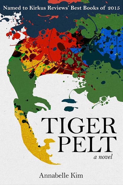
Literary fiction novel covers
—
Literary fiction is a broad genre, but generally means any novel which is felt to have literary merit. Think fictional stories which could potentially be true in our reality. These books are often written to offer insight into the world we live in. At first, it sounds tough to design a cover which draws a reader into… the world they already live in? Ironically, because they’re rooted in the real world literary fiction novels tend to have some of the most stylized, least realistic covers of all the genres.
Trying to find patterns among literary fiction covers is nearly impossible; their artwork is as diverse as the books themselves. We see photography—both landscape and portrait. We see abstract and representational illustration. We see bold, bright books with just the title. We see images that represent the action and characters in the books, and those that use images as metaphor.
Here are a couple of our favorites, in very diverse styles:


What to keep in mind
If you’re writing literary fiction, make sure your cover art fits the mood and style of your book.
Epilogue
—
Next time a book cover “grabs” you, think about the book cover design techniques in this article. Also don’t forget, we’ve showcased only several of the more popular styles. There are many more! Don’t be afraid to experiment or identify different techniques used in other cover examples. Also if you’re doing a series, remember that designs need to be adaptable/flexible to look cohesive throughout the series. Think along the lines of aligning book spines, title placement and puzzle piecing. For more on series check out the full article here!
Ready to get the cover for your book? Launch a cover design contest now or check out our other book design services!
—
This article was written with input from workerbee.